CLASSIC OHIO PATTERN
VECTOR PATTERN DESIGN
My state pride inspired me to create a whimsical, Ohio themed pattern for a school design project. The project brief suggested creating a Halloween pattern, but I had the creative freedom to select a different theme. I chose an Ohio theme because it is appropriate year-round, rather than restricted to a holiday. This distinction opens my design up to a broader range of applications.
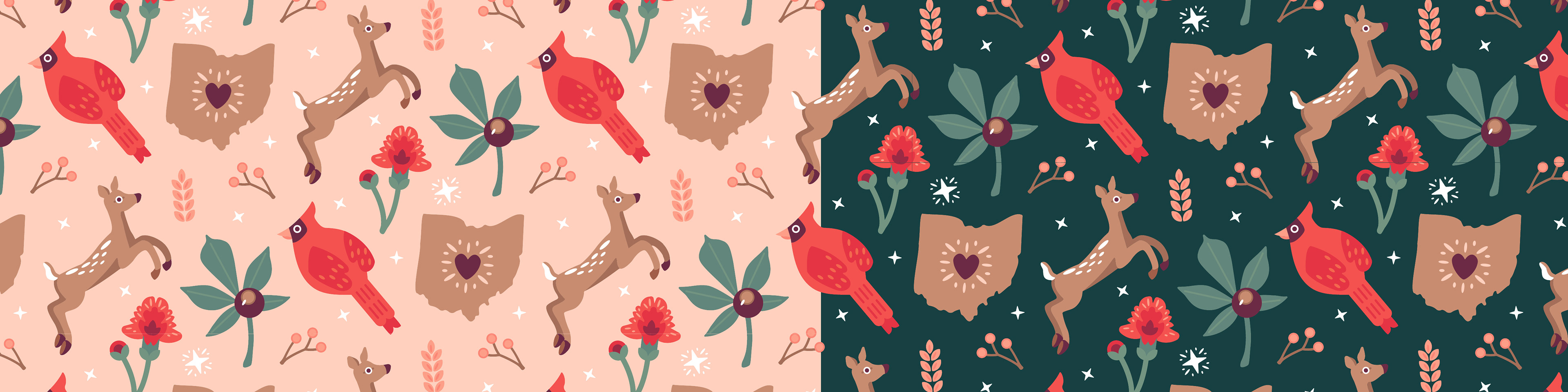
The resulting pattern features several symbols of the state in a seamless, directional arrangement. To appeal to a larger audience, I designed two pattern color schemes—one light and one dark. The two choices allow for more customization for the user. Below are examples of how the pattern applies to various products.
TYPE: Personal, School
SKILLS: Pattern Design, Illustration
TOOLS: Illustrator
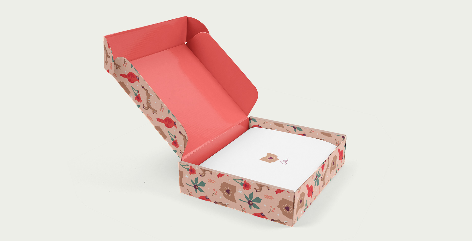
ABOVE: The pattern applied to cardboard box packaging which could be used to hold apparel, food items, etc.
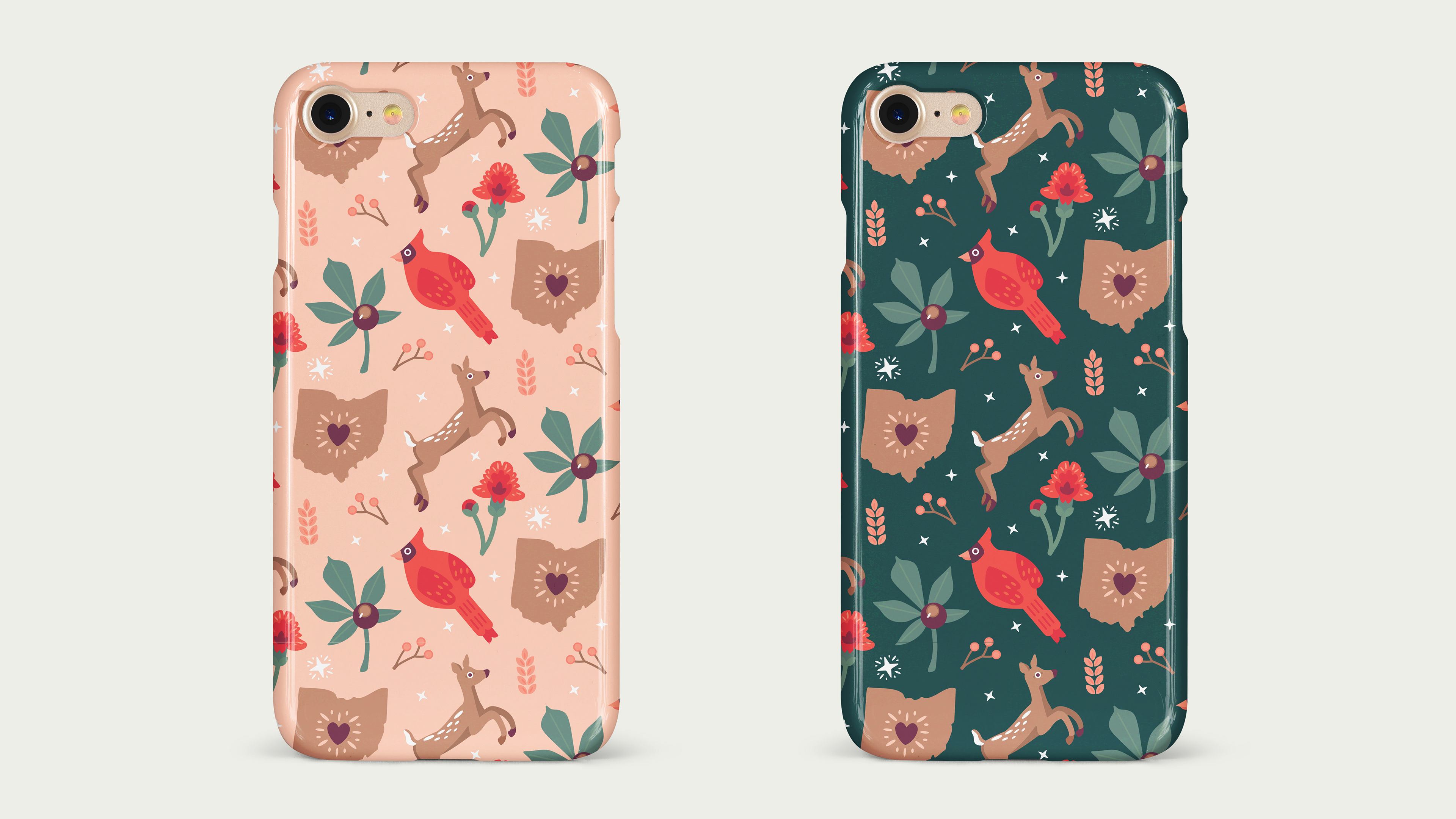
ABOVE: Two versions of the pattern on phone cases.
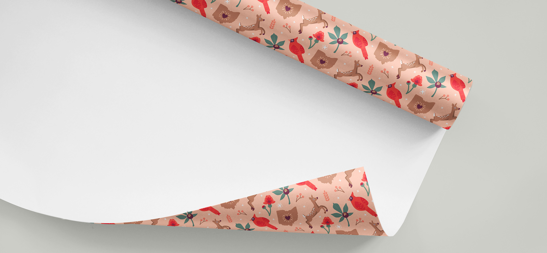
ABOVE: The pattern printed on wrapping paper that could be used year round or for the winter holidays.
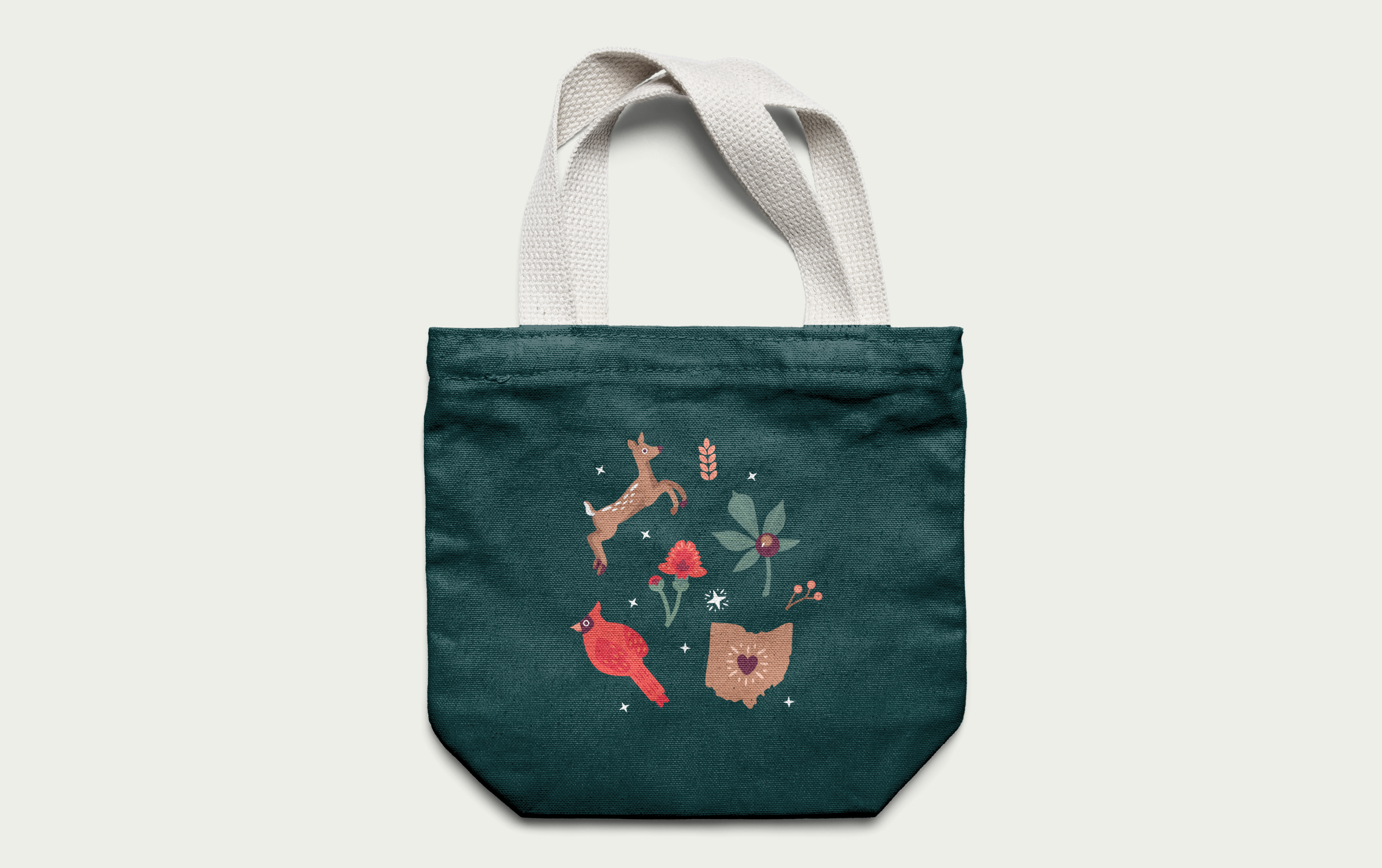
ABOVE: An extracted section of the print applied to a canvas bag.

DESIGN PROCESS: Ideation > Visual Research > Sketches > Design & Build > Iterations > Final Design
I. IDEATION: My first step was to brainstorm themes for my pattern. I ended up choosing an Ohio theme because it is not holiday or gender-specific, so it would appeal to a larger audience than others might.
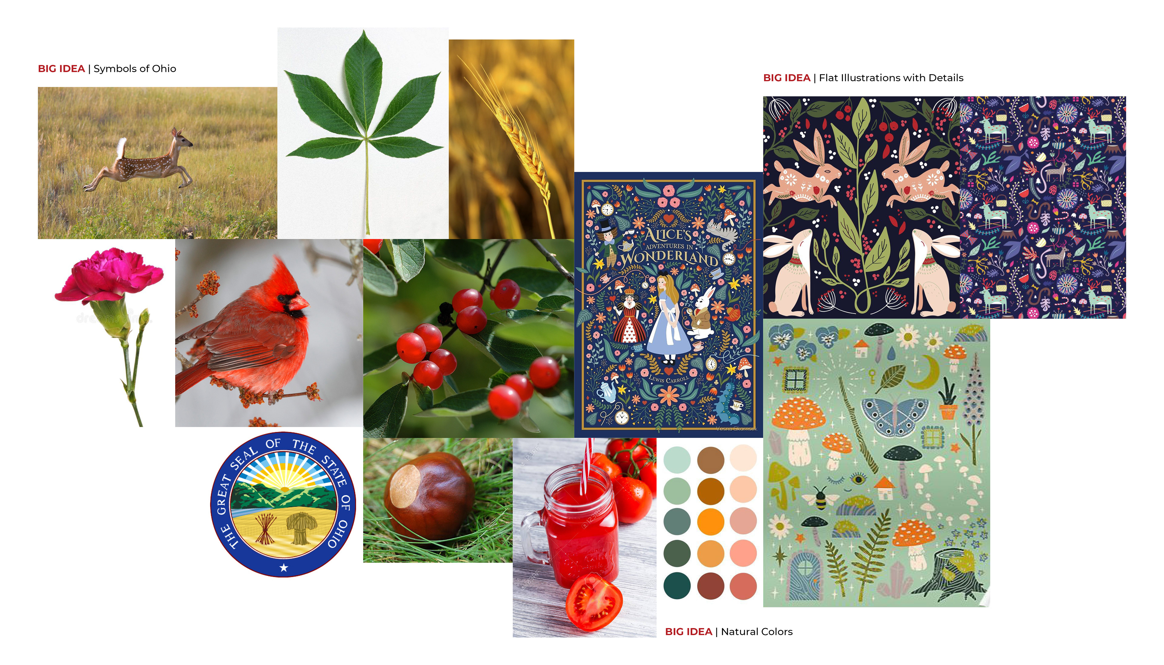
II. VISUAL RESEARCH: I began researching the symbols of my state, such as the national bird, fruit, and flower. I collected images for these symbols, as well as inspiration for my illustration style and color palette. (shown below)
III. SKETCHES: Next, I started to develop my illustrations by sketching out the various Ohio symbols. I explored different shapes and levels of realism.
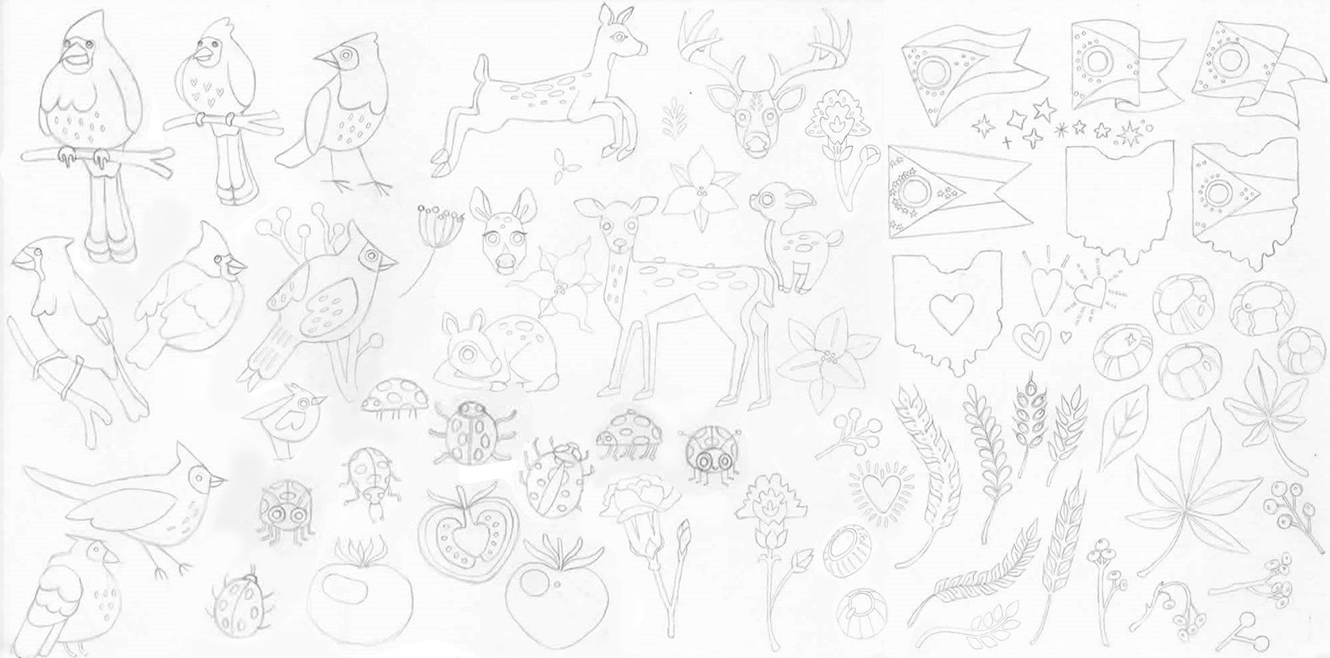
IV. DESIGN & BUILD, ITERATIONS, & FINAL DESIGN: I chose the white-tailed deer, carnation, cardinal, state, and buckeye as the main pattern illustrations out of my sketches. I decided to use stars, wheat stalks, and holly branches as filler illustrations.
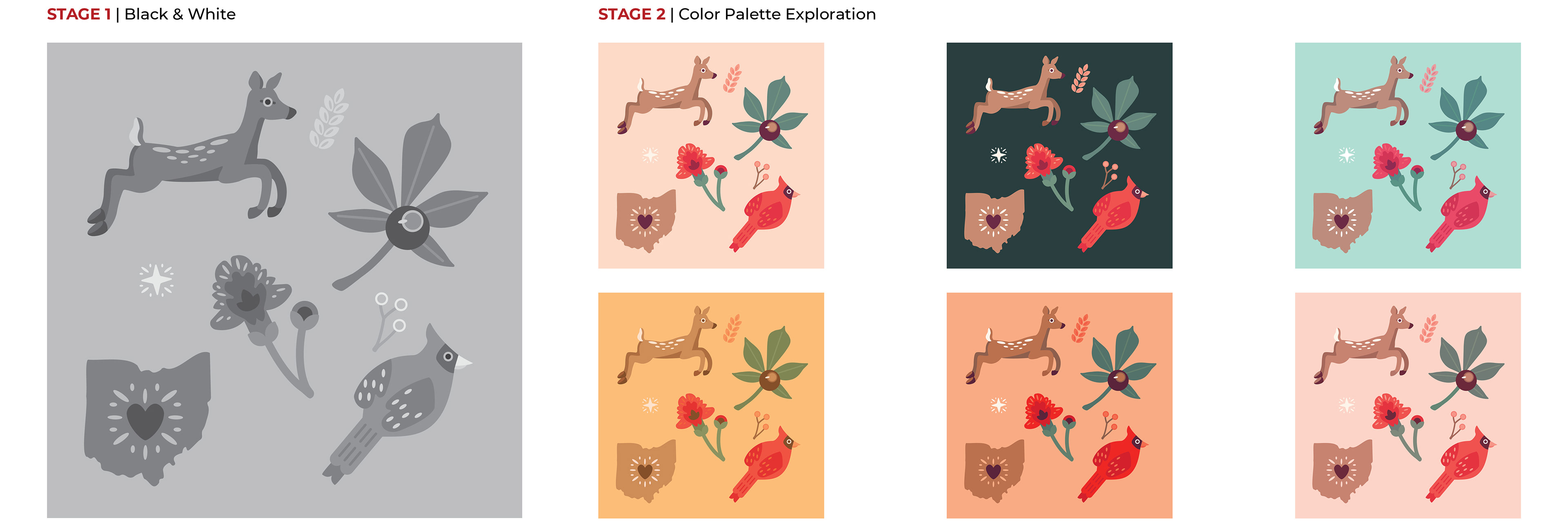
First, I developed my favorite sketches in grayscale in Illustrator. Once I finalized my shape designs, I explored different color palettes. The top left two images are the final color palettes I selected due to their soft, natural tones and contrast.

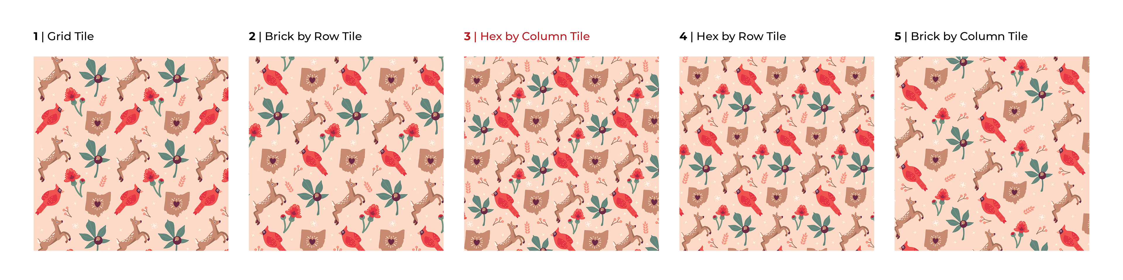
In Illustrator, I used the pattern making feature to test different pattern arrangements, such as grid, brick by row, and hex by column.
Below are the final two pattern designs.