HOME SWEET HOMES
Editorial Illustration
"The Psychology of Home: Why Where You Live Means So Much" is an article about how people have many homes throughout their lives, which become part of who they are. This article was the topic for a school project for which I had to create an editorial illustration based on its main ideas.
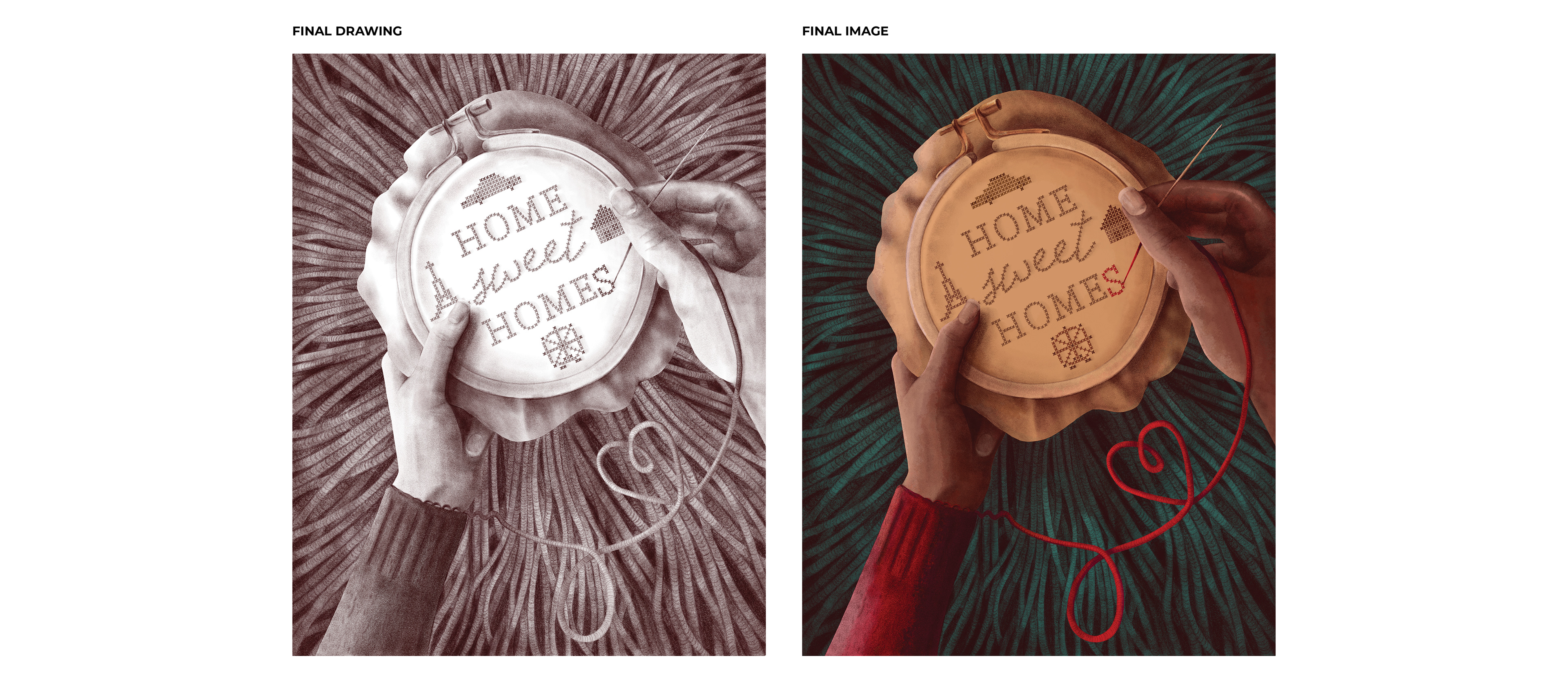
My illustration captures these themes by using a play on the common saying "home sweet home," which I usually imagine being embroidered and framed on a wall. Instead of the usual phrase, my illustration features "home sweet homes" being sewn by an individual, while the thread comes from their sleeve. This image draws connections between the two main ideas of the article: the plurality of homes and the home as an extension of ourselves.
TYPE: Personal, School
SKILLS: Digital Illustration
TOOLS: Adobe Fresco
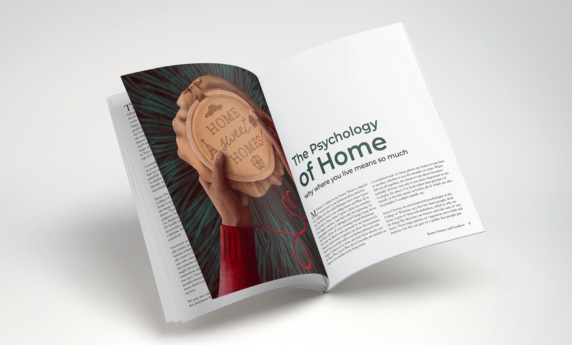
ABOVE: The editorial illustration next to its article, shown in a magazine mockup.

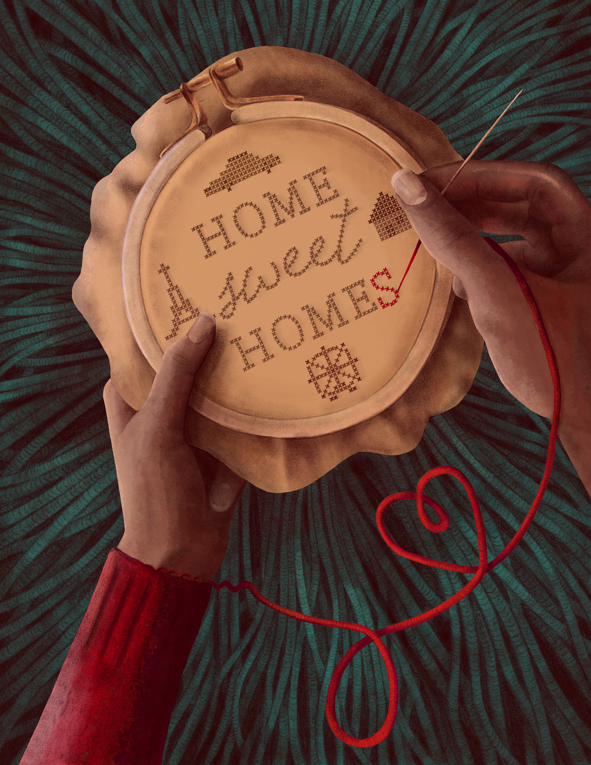

Left: A clearer view of the final illustration. The red sweater leads the eye to the red "s" at the end of "homes," drawing attention to the message of the illustration.
DESIGN PROCESS: Ideation > Visual Research > Iterations > Design & Build > Final Design
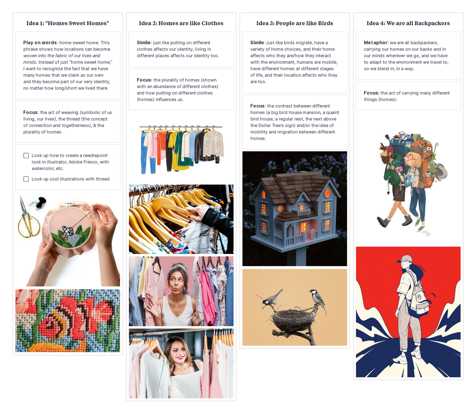
I. IDEATION: While reading the article, I made notes about the main ideas and ways they could translate into images. Below are four concepts based on the main idea that we have many homes over our lives that become a part of who we are.
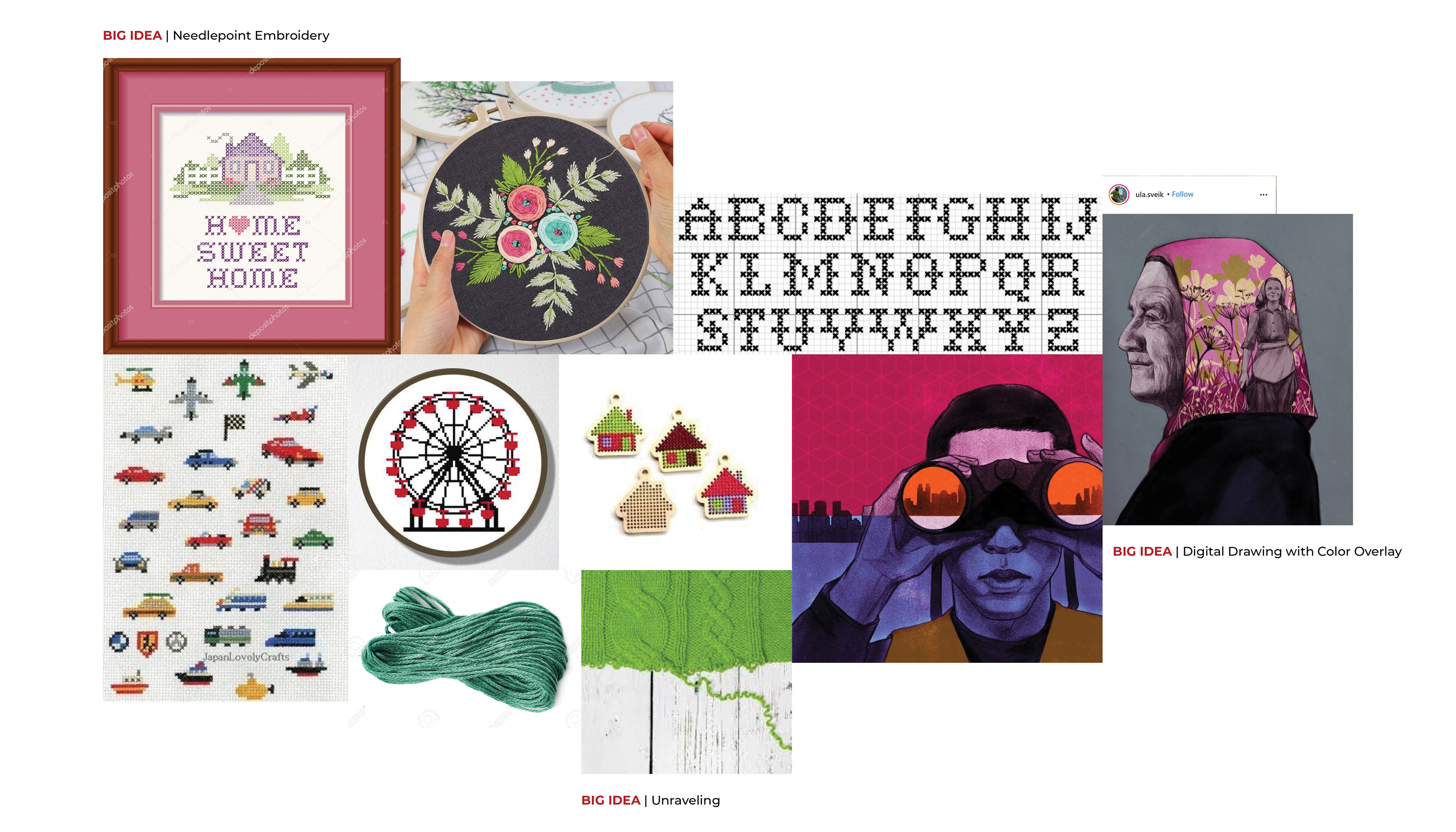
II. VISUAL RESEARCH: Next, I collected imagery and existing editorial illustrations to influence my sketches. Shown are the images I gathered for my first concept about a needlepoint "home sweet homes" embroidery hoop.
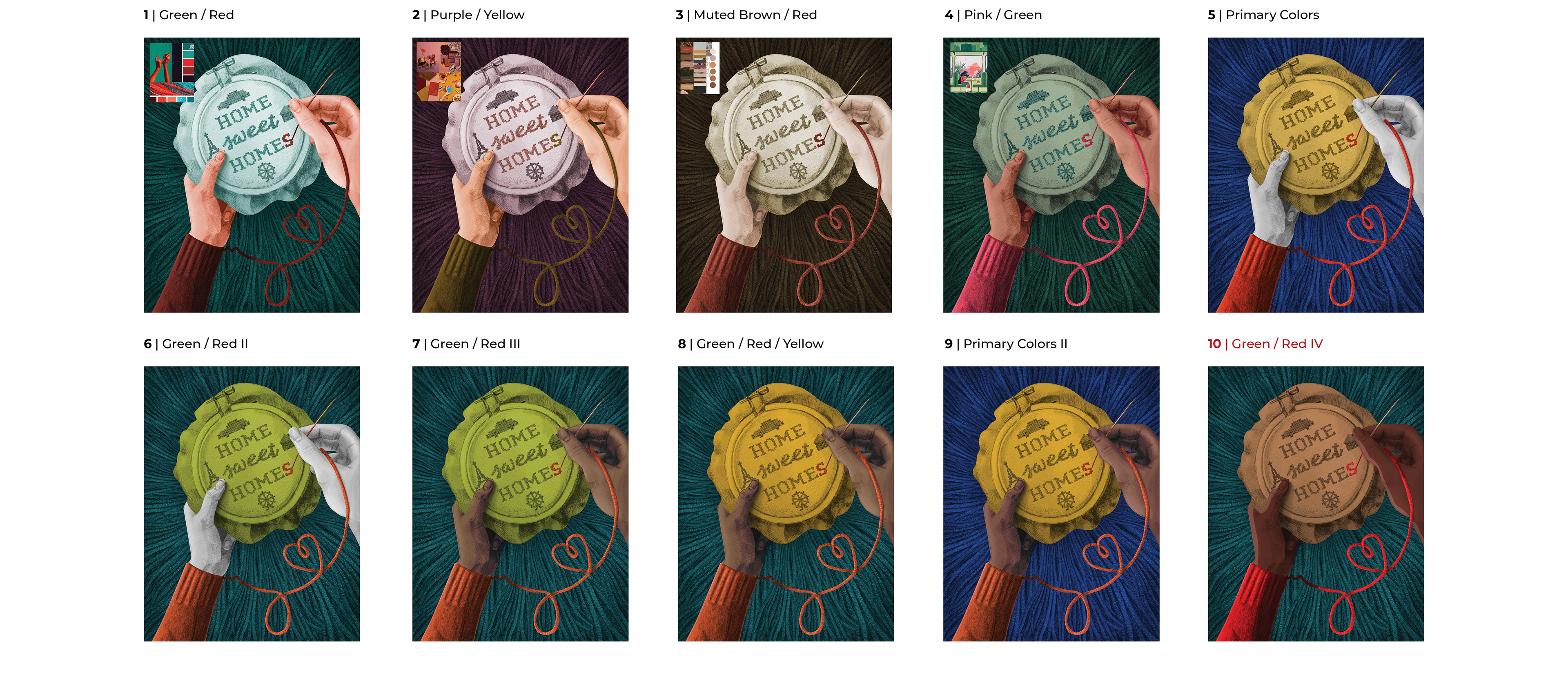
III. ITERATIONS: Below are the ten thumbnail sketches I completed, each referring to a different concept I developed during my brainstorming.
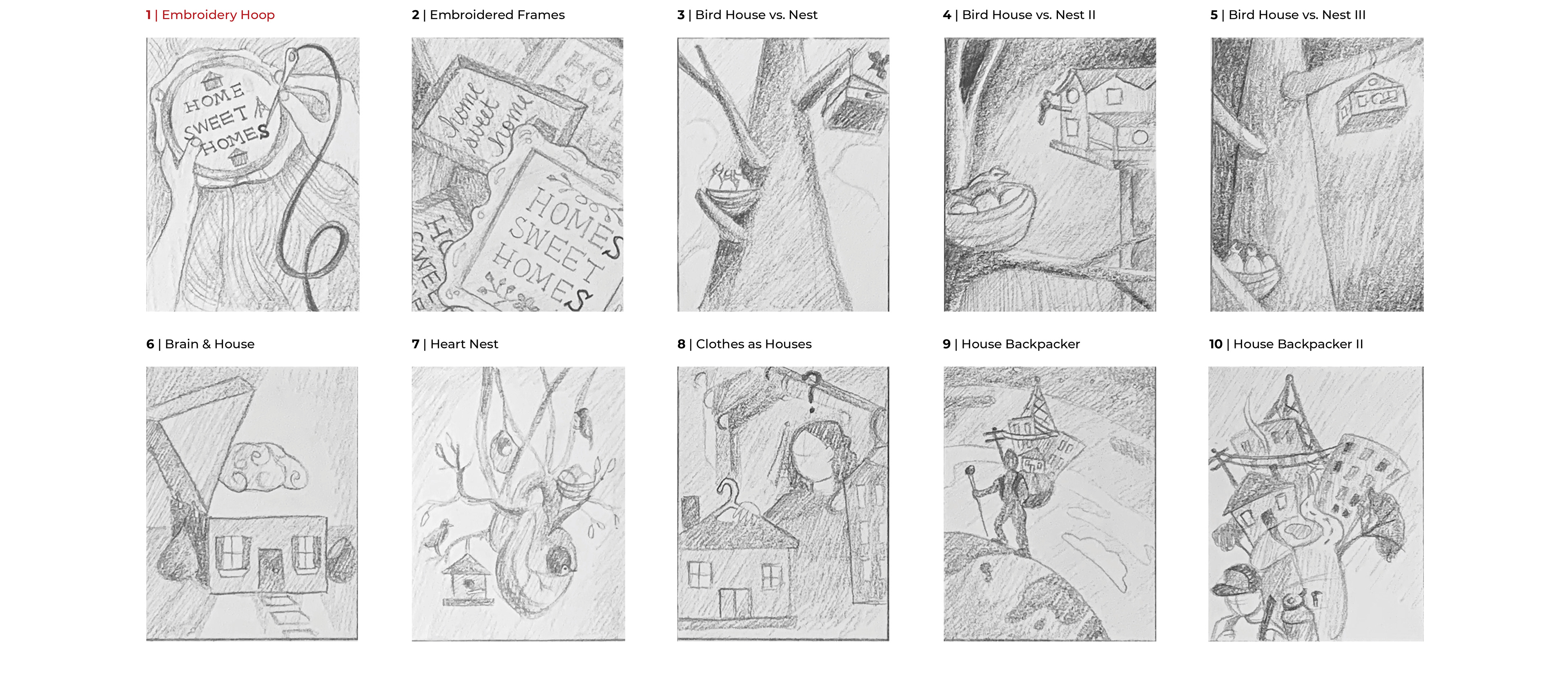
I chose my first thumbnail because I felt that the twist on the phrase "home sweet home" to "home sweet homes" captured the idea of multiple homes the most clearly and cleverly. However, I wanted to develop the concept more to include the idea that our homes are an extension of ourselves.
The eighth thumbnail captures this concept because the thread is unraveling from the person's sweater. This detail makes a connection between the two main ideas of the article.
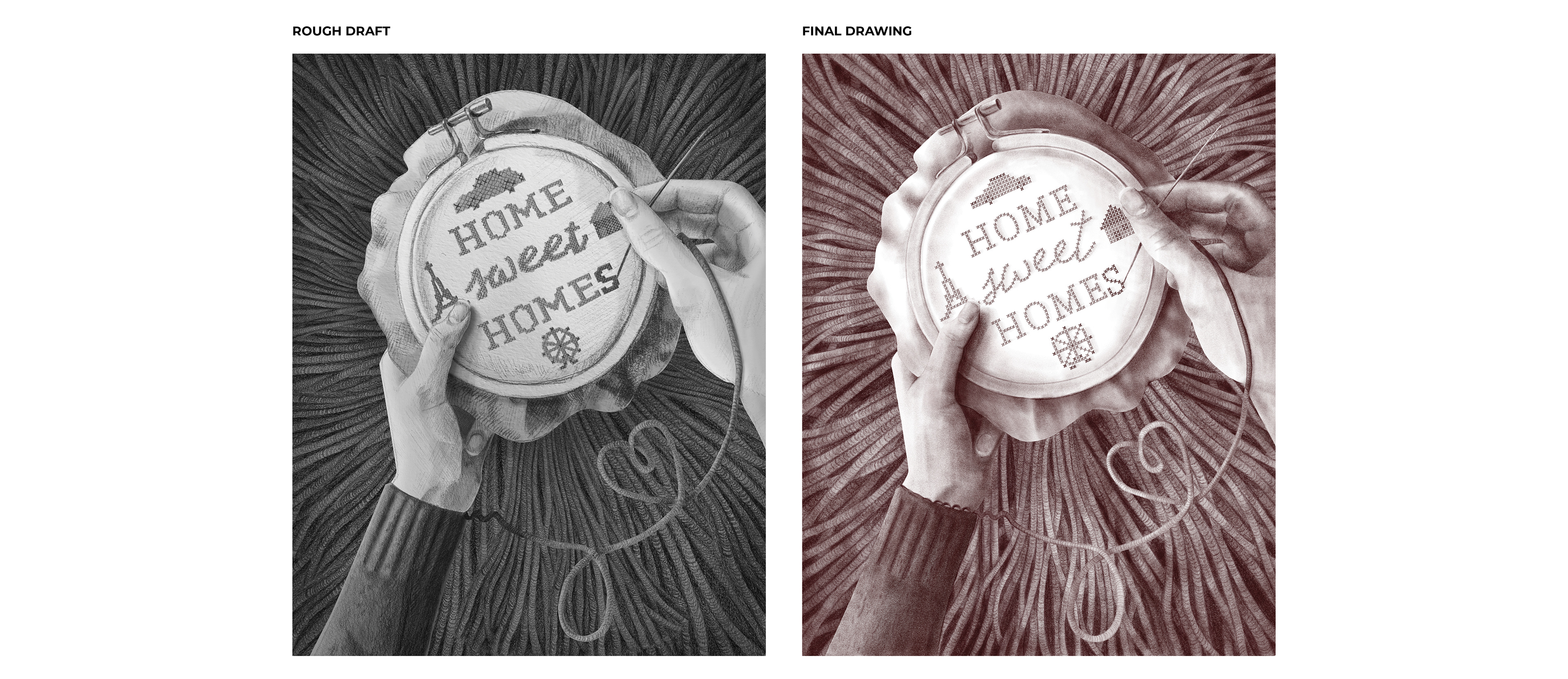
Below is the rough draft drawing I created out of the eighth thumbnail, which I then used as my blueprint for my final pencil drawing in Adobe Fresco. I chose a deep red-brown for the drawing to add another layer of dimension and warmth.
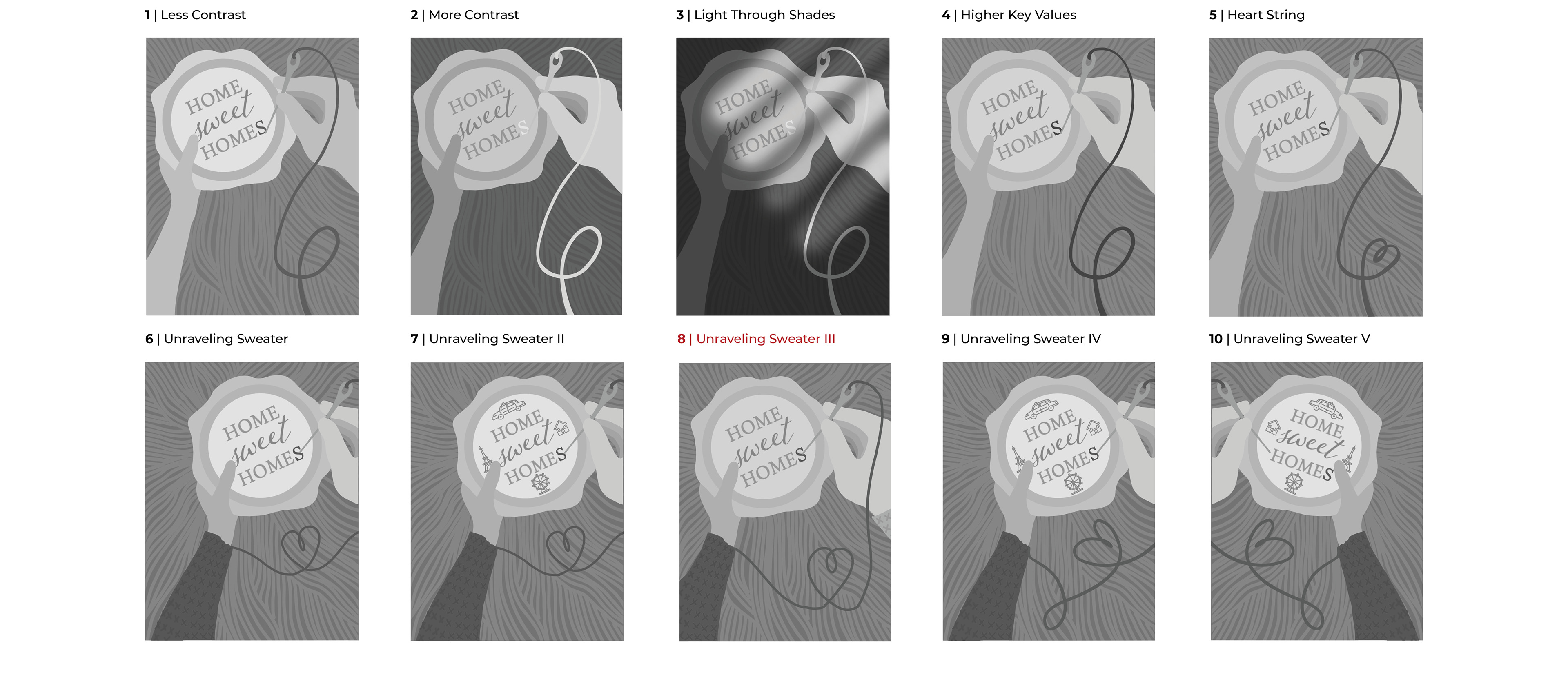
Before adding color to my final drawing, I completed multiple color comps to test out color schemes. I wanted the composition to feel warm and intimate, like the feeling one usually gets at home. The last color composition fulfilled these criteria as it still has contrasting colors, but they are warm and muted.
IV. DESIGN & BUILD, REVISIONS, & FINAL DESIGN: My last step was to apply color to my final drawing. Since I completed the drawing digitally, I was able to add in color underneath it while retaining the pencil texture.